

Currency input — About
Localization
Section titled “Localization”The whole point of the library. You pass a locale and a currency; everything else — separators,
symbol placement, fraction digits, grouping rules, digits — is read from Intl.NumberFormat.
Locale and currency
Section titled “Locale and currency”function Demo() { const [locale, setLocale] = React.useState('bg-BG') const [currency, setCurrency] = React.useState('EUR') const [value, setValue] = React.useState(1234567.89) return ( <div> <label> Locale{' '} <select value={locale} onChange={(e) => setLocale(e.target.value)}> {['bg-BG', 'de-DE', 'fr-FR', 'en-US', 'hi-IN', 'ja-JP', 'ar-EG', 'de-CH'].map((l) => ( <option key={l}>{l}</option> ))} </select> </label>{' '} <label> Currency{' '} <select value={currency} onChange={(e) => setCurrency(e.target.value)}> {['EUR', 'USD', 'JPY', 'INR', 'EGP', 'CHF', 'KWD'].map((c) => ( <option key={c}>{c}</option> ))} </select> </label> <p> <CurrencyInput locale={locale} currency={currency} value={value} onChange={setValue} aria-label="Amount" /> </p> </div> ) }
UI-library recipes
Section titled “UI-library recipes”These examples compile against the UI-library versions used by this repository. Single native inputs can hand their hook contract to the design system; composite widgets keep their tested semantics intact and use the design system for field chrome.
shadcn/ui
        'use client'

import { CurrencyField } from '@/components/rxova/currency-field'

export function ShadcnCurrency() {
  return (
    <CurrencyField
      label="Price"
      description="Enter the price before tax."
      name="price"
      locale="en-US"
      currency="USD"
      defaultValue={1250}
    />
  )
}
Radix Themes
        'use client'

import { useState } from 'react'
import { Text, TextField } from '@radix-ui/themes'
import { useCurrencyInput } from '@rxova/react-intl-currency-input'

export function RadixCurrency() {
  const [value, setValue] = useState<number | null>(null)
  const { inputProps, ref } = useCurrencyInput({
    locale: 'en-US',
    currency: 'USD',
    value,
    onChange: setValue,
  })

  return (
    <label>
      <Text as="div" size="2" weight="bold" mb="1">
        Price
      </Text>
      <TextField.Root {...inputProps} ref={ref} name="price" />
    </label>
  )
}
Material UI
        'use client'

import { useState } from 'react'
import TextField from '@mui/material/TextField'
import { useCurrencyInput } from '@rxova/react-intl-currency-input'

export function MuiCurrency() {
  const [value, setValue] = useState<number | null>(null)
  const { inputProps, ref } = useCurrencyInput({
    locale: 'en-US',
    currency: 'USD',
    value,
    onChange: setValue,
  })

  return (
    <TextField
      name="price"
      label="Price"
      helperText="Enter the price before tax."
      slotProps={{ htmlInput: { ...inputProps, ref } }}
    />
  )
}
Chakra UI
        'use client'

import { useState } from 'react'
import { Field, Input } from '@chakra-ui/react'
import { useCurrencyInput } from '@rxova/react-intl-currency-input'

export function ChakraCurrency() {
  const [value, setValue] = useState<number | null>(null)
  const { inputProps, ref } = useCurrencyInput({
    locale: 'en-US',
    currency: 'USD',
    value,
    onChange: setValue,
  })

  return (
    <Field.Root>
      <Field.Label>Price</Field.Label>
      <Input {...inputProps} ref={ref} name="price" />
      <Field.HelperText>Enter the price before tax.</Field.HelperText>
    </Field.Root>
  )
}
Mantine
        'use client'

import { useState } from 'react'
import { TextInput } from '@mantine/core'
import { useCurrencyInput } from '@rxova/react-intl-currency-input'

export function MantineCurrency() {
  const [value, setValue] = useState<number | null>(null)
  const { inputProps, ref } = useCurrencyInput({
    locale: 'en-US',
    currency: 'USD',
    value,
    onChange: setValue,
  })

  return (
    <TextInput
      {...inputProps}
      ref={ref}
      name="price"
      label="Price"
      description="Enter the price before tax."
    />
  )
}
Ant Design
        'use client'

import { useState } from 'react'
import { Form, Input } from 'antd'
import { useCurrencyInput } from '@rxova/react-intl-currency-input'

export function AntCurrency() {
  const [value, setValue] = useState<number | null>(null)
  const { inputProps } = useCurrencyInput({
    locale: 'en-US',
    currency: 'USD',
    formatMode: 'blur',
    value,
    onChange: setValue,
  })

  return (
    <Form.Item label="Price" extra="Enter the price before tax.">
      <Input {...inputProps} name="price" />
    </Form.Item>
  )
}
locale, or language + country
Section titled “locale, or language + country”You can pass a BCP-47 locale directly, or the language and country separately — whichever your
app already carries. locale wins when both are present.
import { CurrencyInput } from '@rxova/react-intl-currency-input'
function LocaleExamples() {  return (    <>      {/* Pass a complete BCP-47 locale… */}      <CurrencyInput locale="bg-BG" currency="EUR" aria-label="Amount by locale" />
      {/* …or pass its language and country separately. */}      <CurrencyInput language="bg" country="BG" currency="EUR" aria-label="Amount by parts" />    </>  )}
The locales other libraries get wrong
Section titled “The locales other libraries get wrong”The same 1234567.89, formatted by the same code — the language decides the separators, symbol side
and digits, the currency decides the fraction count:
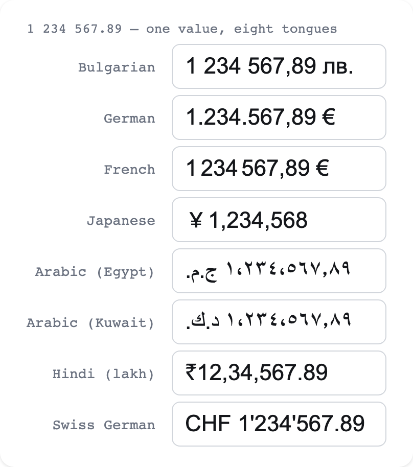
None of these is a special case in the code — the same path formats all of them.
| Locale | Currency | Renders 1234567.89 as | The catch |
|---|---|---|---|
bg-BG | EUR | 1 234 567,89 € | Group separator is a non-breaking space |
de-DE | EUR | 1.234.567,89 € | Group is ., decimal is ,, symbol trails |
fr-FR | EUR | 1 234 567,89 € | Group is a narrow no-break space (U+202F) |
hi-IN | INR | ₹12,34,567.89 | Lakh grouping — not groups of three |
ja-JP | JPY | ¥1,234,567 | No fraction digits |
ar-KW | KWD | (three decimals) | Three fraction digits |
ar-EG | EGP | native Arabic digits | Non-ASCII digits, right-to-left |
de-CH | CHF | CHF 1'234'567.89 | Apostrophe group separator |
The Bulgarian rule
Section titled “The Bulgarian rule”Bulgarian only groups above 9999. The library inherits this from CLDR — there is no branch for it.
function Demo() {
  return (
    <ul>
      {[5000, 9999, 10000, 50000].map((n) => (
        <li key={n}>
          <CurrencyInput locale="bg-BG" currency="EUR" value={n} aria-label={String(n)} />
        </li>
      ))}
    </ul>
  )
}
The same currency, in many languages
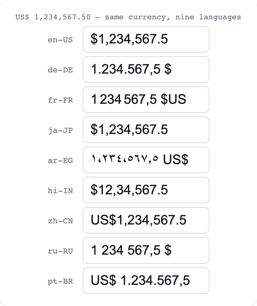
Section titled “The same currency, in many languages”The currency and the language are independent. Show US dollars to a German user, or euros to a Bulgarian one — the fraction-digit count follows the currency (USD is always 2, JPY always 0, KWD always 3), while the separators, symbol placement and digits follow the language:
function Demo() {
  return (
    <ul>
      {['en-US', 'de-DE', 'fr-FR', 'ja-JP', 'hi-IN', 'ru-RU', 'pt-BR'].map((locale) => (
        <li key={locale}>
          <code>{locale}</code>:{' '}
          <CurrencyInput locale={locale} currency="USD" value={1234567.5} aria-label={locale} />
        </li>
      ))}
    </ul>
  )
}
Native digits
Section titled “Native digits”Locales like ar-EG render non-ASCII digits by default. While editing, the field shows ASCII digits
(you type on an ASCII keyboard), but on blur it renders in the locale’s native digits, right-to-left:
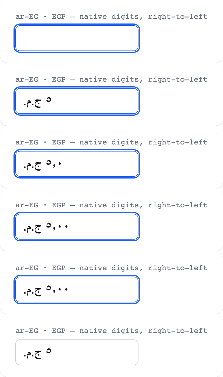
It also parses native digits, so a paste works. Force a numbering system end-to-end with
numberingSystem.
<CurrencyInput locale="ar-EG" currency="EGP" numberingSystem="latn" />A note on Intl and Node versions
Section titled “A note on Intl and Node versions”Intl output can differ between ICU versions. If you assert formatted strings in tests, derive the
separators from the formatter rather than hardcoding a literal space.
UI libraries and custom inputs
Section titled “UI libraries and custom inputs”CurrencyInput is the ready-made native input. When a design system already provides the input
element, use the exported useCurrencyInput hook instead. It owns the currency state machine and
returns native-compatible inputProps; the UI library keeps ownership of labels, borders, helper
text, slots, themes, and layout.
import { useState } from 'react'import { useCurrencyInput } from '@rxova/react-intl-currency-input'
function HeadlessExample() {  const [value, setValue] = useState<number | null>(null)  const currency = useCurrencyInput({    locale: 'bg-BG',    currency: 'EUR',    value,    onChange: setValue,  })
  return <input {...currency.inputProps} aria-label="Amount" />}
The examples below all use that same contract. No adapter package is required.
shadcn/ui
Section titled “shadcn/ui”shadcn’s Input is a styled native input copied into
your application, so the hook props spread directly onto it. Keep error semantics on both the field
and the control.
import { useState } from 'react'import { Input } from '@/components/ui/input'import { Label } from '@/components/ui/label'import { useCurrencyInput } from '@rxova/react-intl-currency-input'
export function ShadcnPrice() {  const [value, setValue] = useState<number | null>(null)  const invalid = value !== null && value < 1  const { inputProps } = useCurrencyInput({    locale: 'bg-BG',    currency: 'EUR',    value,    onChange: setValue,  })
  return (    <div className="grid gap-2" data-invalid={invalid || undefined}>      <Label htmlFor="price">Price</Label>      <Input        {...inputProps}        id="price"        name="price"        aria-invalid={invalid || undefined}        aria-describedby={invalid ? 'price-error' : undefined}        className="text-end tabular-nums"      />      {invalid && (        <p id="price-error" className="text-sm text-destructive">          Price must be at least 1 €.        </p>      )}    </div>  )}
Radix Themes
Section titled “Radix Themes”Radix Themes TextField.Root forwards
native input props and its ref to the internal input. Slots remain available for non-currency
decoration; do not add a fixed € or $ slot because Intl already places the localized currency
token on the correct side.
import { useState } from 'react'import { Text, TextField } from '@radix-ui/themes'import { useCurrencyInput } from '@rxova/react-intl-currency-input'
export function RadixPrice() {  const [value, setValue] = useState<number | null>(null)  const invalid = value !== null && value < 1  const { inputProps } = useCurrencyInput({    locale: 'de-DE',    currency: 'EUR',    value,    onChange: setValue,  })
  return (    <label>      <Text as="div" size="2" weight="bold" mb="1">        Price      </Text>      <TextField.Root        {...inputProps}        name="price"        color={invalid ? 'red' : undefined}        aria-invalid={invalid || undefined}        aria-describedby={invalid ? 'radix-price-error' : undefined}      />      {invalid && (        <Text id="radix-price-error" as="div" size="1" color="red" mt="1">          Price must be at least 1 €.        </Text>      )}    </label>  )}
Material UI
Section titled “Material UI”MUI’s TextField owns the label, helper text, and
error presentation. Current MUI versions use slotProps.htmlInput for attributes that must land on
the underlying HTML input, so route inputMode there and spread the remaining controlled props onto
TextField.
import { useState } from 'react'import TextField from '@mui/material/TextField'import { useCurrencyInput } from '@rxova/react-intl-currency-input'
export function MuiPrice() {  const [value, setValue] = useState<number | null>(null)  const invalid = value !== null && value < 1  const { inputProps } = useCurrencyInput({    locale: 'de-DE',    currency: 'EUR',    value,    onChange: setValue,  })  const { inputMode, ...textFieldProps } = inputProps
  return (    <TextField      {...textFieldProps}      name="price"      label="Price"      error={invalid}      helperText={invalid ? 'Price must be at least 1 €.' : 'Enter the price before tax.'}      slotProps={{ htmlInput: { inputMode } }}      sx={{ '& input': { textAlign: 'end', fontVariantNumeric: 'tabular-nums' } }}    />  )}
Do not use MUI type="number": the hook intentionally supplies type="text" plus
inputMode="decimal", allowing locale decimal separators and formatted idle text.
Chakra UI
Section titled “Chakra UI”Chakra’s Input accepts native input props. Compose
it with Field for the visible label, helper text, and error state.
import { useState } from 'react'import { Field, Input } from '@chakra-ui/react'import { useCurrencyInput } from '@rxova/react-intl-currency-input'
export function ChakraPrice() {  const [value, setValue] = useState<number | null>(null)  const invalid = value !== null && value < 1  const { inputProps } = useCurrencyInput({    locale: 'fr-FR',    currency: 'EUR',    value,    onChange: setValue,  })
  return (    <Field.Root invalid={invalid}>      <Field.Label>Price</Field.Label>      <Input {...inputProps} name="price" textAlign="end" fontVariantNumeric="tabular-nums" />      <Field.HelperText>Enter the price before tax.</Field.HelperText>      <Field.ErrorText>Price must be at least 1 €.</Field.ErrorText>    </Field.Root>  )}
Mantine
Section titled “Mantine”Mantine TextInput supports all native input props and
provides its own accessible label, description, error message, and Styles API.
import { useState } from 'react'import { TextInput } from '@mantine/core'import { useCurrencyInput } from '@rxova/react-intl-currency-input'
export function MantinePrice() {  const [value, setValue] = useState<number | null>(null)  const invalid = value !== null && value < 1  const { inputProps } = useCurrencyInput({    locale: 'fr-FR',    currency: 'EUR',    value,    onChange: setValue,  })
  return (    <TextInput      {...inputProps}      name="price"      label="Price"      description="Enter the price before tax."      error={invalid ? 'Price must be at least 1 €.' : undefined}      styles={{ input: { textAlign: 'end', fontVariantNumeric: 'tabular-nums' } }}    />  )}
Ant Design
Section titled “Ant Design”Ant Design Input also accepts the native controlled-input
contract. Use Form.Item for layout and validation presentation, but leave numeric state with the
hook rather than giving the same field to Ant Form’s automatic value injection.
import { useState } from 'react'import { Form, Input } from 'antd'import { useCurrencyInput } from '@rxova/react-intl-currency-input'
export function AntPrice() {  const [value, setValue] = useState<number | null>(null)  const invalid = value !== null && value < 1  const { inputProps } = useCurrencyInput({    locale: 'en-US',    currency: 'USD',    value,    onChange: setValue,  })
  return (    <Form.Item      label="Price"      validateStatus={invalid ? 'error' : undefined}      help={invalid ? 'Price must be at least $1.' : 'Enter the price before tax.'}    >      <Input        {...inputProps}        name="price"        status={invalid ? 'error' : undefined}        style={{ textAlign: 'end', fontVariantNumeric: 'tabular-nums' }}      />    </Form.Item>  )}
What the hook owns
Section titled “What the hook owns”inputProps contains the props that must stay together for correct behavior:
| Prop | Purpose |
|---|---|
value | Formatted while idle; plain and locale-editable while focused |
type="text" | Allows localized and formatted text; never replace it with number |
inputMode="decimal" | Requests a numeric mobile keyboard without imposing number-input parsing |
onChange | Sanitizes and parses browser input |
onFocus / onBlur | Switch between editable and formatted representations |
onKeyDown | Implements opt-in step behavior while preserving modified shortcuts |
autoComplete | Defaults to off, but can be adapted by a wrapper if your product requires otherwise |
Spread inputProps before visual props so your library can still receive label, error, size,
and theme options. Do not replace its value or event handlers. If you need an application callback,
compose it explicitly:
<YourInput {...inputProps} onBlur={(event) => { inputProps.onBlur(event) markTouched() }}/>The hook also returns the numeric value, current display, focused, imperative setValue,
format/parse helpers, and the resolved separators and currency symbol. See the
useCurrencyInput API reference for the complete result.
Styling
Section titled “Styling”CurrencyInput renders one native <input> and ships no CSS. There is no theme to reset, no
generated wrapper to work around, and no stylesheet to put in your bundle. Give it a className, an
inline style, or any native data-* attribute and style it exactly like the rest of your form.
Already using a component library? The exported useCurrencyInput hook drives its input without
replacing its visuals. See the shadcn/ui, Radix Themes, MUI, Chakra, Mantine, and Ant Design
recipes.
Interactive playground
Section titled “Interactive playground”Use this to sketch the visual contract for your field. Focus the input to see its editable form, type a value, and blur it to see the locale apply grouping and place the currency symbol. The panel underneath is valid CSS you can paste into your own stylesheet.
function StylingPlayground() {
  const [value, setValue] = React.useState(1234567.89)
  const [locale, setLocale] = React.useState('bg-BG')
  const [fontSize, setFontSize] = React.useState(1)
  const [padding, setPadding] = React.useState(0.75)
  const [radius, setRadius] = React.useState(0.5)
  const [align, setAlign] = React.useState('end')
  const [border, setBorder] = React.useState('#94a3b8')
  const [surface, setSurface] = React.useState('#ffffff')
  const [text, setText] = React.useState('#0f172a')

  const style = {
    boxSizing: 'border-box',
    inlineSize: '100%',
    maxInlineSize: '24rem',
    minBlockSize: '2.75rem',
    border: `1px solid ${border}`,
    borderRadius: `${radius}rem`,
    padding: `${padding * 0.75}rem ${padding}rem`,
    background: surface,
    color: text,
    font: 'inherit',
    fontSize: `${fontSize}rem`,
    fontVariantNumeric: 'tabular-nums',
    textAlign: align,
  }

  const Row = ({ label, children, output }) => (
    <label
      style={{
        display: 'grid',
        gridTemplateColumns: '5.5rem minmax(8rem, 1fr) 4.5rem',
        alignItems: 'center',
        gap: '0.75rem',
      }}
    >
      <span style={{ fontSize: '0.875rem' }}>{label}</span>
      {children}
      <code style={{ textAlign: 'end' }}>{output}</code>
    </label>
  )

  const css = `.money-input {
  box-sizing: border-box;
  inline-size: 100%;
  max-inline-size: 24rem;
  min-block-size: 2.75rem;
  border: 1px solid ${border};
  border-radius: ${radius}rem;
  padding: ${padding * 0.75}rem ${padding}rem;
  background: ${surface};
  color: ${text};
  font: inherit;
  font-size: ${fontSize}rem;
  font-variant-numeric: tabular-nums;
  text-align: ${align};
}`

  return (
    <div style={{ display: 'grid', gap: '1.25rem' }}>
      <div style={{ display: 'grid', gap: '0.5rem' }}>
        <label htmlFor="styled-amount" style={{ fontWeight: 650 }}>
          Amount
        </label>
        <CurrencyInput
          id="styled-amount"
          locale={locale}
          currency={locale === 'ar-EG' ? 'EGP' : locale === 'hi-IN' ? 'INR' : 'EUR'}
          value={value}
          onChange={setValue}
          style={style}
        />
        <span style={{ color: '#475569', fontSize: '0.875rem' }}>
          Focus, edit, then blur to see the two display states.
        </span>
      </div>

      <div style={{ display: 'grid', gap: '0.625rem', maxWidth: 520 }}>
        <label style={{ display: 'grid', gridTemplateColumns: '5.5rem 1fr', gap: '0.75rem' }}>
          <span style={{ fontSize: '0.875rem' }}>locale</span>
          <select value={locale} onChange={(event) => setLocale(event.target.value)}>
            <option value="bg-BG">bg-BG · Bulgarian</option>
            <option value="en-US">en-US · English</option>
            <option value="de-DE">de-DE · German</option>
            <option value="fr-FR">fr-FR · French</option>
            <option value="hi-IN">hi-IN · Hindi</option>
            <option value="ar-EG">ar-EG · Arabic</option>
          </select>
        </label>
        <Row label="type size" output={`${fontSize}rem`}>
          <input
            type="range"
            min={0.75}
            max={2}
            step={0.125}
            value={fontSize}
            onChange={(event) => setFontSize(+event.target.value)}
          />
        </Row>
        <Row label="spacing" output={`${padding}rem`}>
          <input
            type="range"
            min={0.25}
            max={1.5}
            step={0.125}
            value={padding}
            onChange={(event) => setPadding(+event.target.value)}
          />
        </Row>
        <Row label="radius" output={`${radius}rem`}>
          <input
            type="range"
            min={0}
            max={1.5}
            step={0.125}
            value={radius}
            onChange={(event) => setRadius(+event.target.value)}
          />
        </Row>
        <label style={{ display: 'grid', gridTemplateColumns: '5.5rem 1fr', gap: '0.75rem' }}>
          <span style={{ fontSize: '0.875rem' }}>alignment</span>
          <select value={align} onChange={(event) => setAlign(event.target.value)}>
            <option value="start">start</option>
            <option value="center">center</option>
            <option value="end">end</option>
          </select>
        </label>
        {[
          ['border', border, setBorder],
          ['surface', surface, setSurface],
          ['text', text, setText],
        ].map(([label, color, setColor]) => (
          <Row key={label} label={label} output={color}>
            <input type="color" value={color} onChange={(event) => setColor(event.target.value)} />
          </Row>
        ))}
      </div>

      <pre style={{ margin: 0 }}>{css}</pre>
    </div>
  )
}
A complete field
Section titled “A complete field”The component deliberately owns only currency behavior. Your application owns the label, hint, validation message, spacing, colors, and layout:
import { useId, useState } from 'react'import { CurrencyInput } from '@rxova/react-intl-currency-input'import './price-field.css'
export function PriceField() {  const id = useId()  const hintId = `${id}-hint`  const errorId = `${id}-error`  const [value, setValue] = useState<number | null>(null)  const invalid = value !== null && value < 0.5
  return (    <div className="price-field">      <label className="price-field__label" htmlFor={id}>        Price <span className="price-field__optional">Optional</span>      </label>      <CurrencyInput        id={id}        name="price"        className="price-field__control"        locale="bg-BG"        currency="EUR"        value={value}        onChange={setValue}        placeholder="0,00"        invalid={invalid}        aria-describedby={`${hintId}${invalid ? ` ${errorId}` : ''}`}      />      <p id={hintId} className="price-field__hint">        Enter the price before tax.      </p>      {invalid && (        <p id={errorId} className="price-field__error" role="alert">          Price must be at least 0,50 €.        </p>      )}    </div>  )}
.price-field { --field-border: #94a3b8; --field-focus: #2563eb; --field-error: #b42318; display: grid; gap: 0.375rem; inline-size: min(100%, 22rem);}
.price-field__label { color: #0f172a; font-weight: 650;}
.price-field__optional,.price-field__hint { color: #475569; font-size: 0.875rem; font-weight: 400;}
.price-field__control { box-sizing: border-box; inline-size: 100%; min-block-size: 2.75rem; border: 1px solid var(--field-border); border-radius: 0.5rem; padding: 0.625rem 0.75rem; background: #fff; color: #0f172a; font: inherit; font-variant-numeric: tabular-nums; text-align: end; transition: border-color 120ms, box-shadow 120ms;}
.price-field__control::placeholder { color: #64748b; opacity: 1;}
.price-field__control:hover:not(:disabled) { border-color: #64748b;}
.price-field__control:focus-visible { border-color: var(--field-focus); outline: 3px solid color-mix(in srgb, var(--field-focus) 25%, transparent); outline-offset: 1px;}
.price-field__control[data-invalid] { border-color: var(--field-error);}
.price-field__control[data-invalid]:focus-visible { outline-color: color-mix(in srgb, var(--field-error) 25%, transparent);}
.price-field__control:disabled { cursor: not-allowed; background: #f1f5f9; color: #64748b;}
.price-field__hint,.price-field__error { margin: 0;}
.price-field__error { color: var(--field-error); font-size: 0.875rem;}That CSS covers the states users need to distinguish: rest, hover, keyboard focus, invalid, and
disabled. invalid puts both aria-invalid="true" and data-invalid on the input, so semantics and
visual styling stay in sync.
Styling hooks
Section titled “Styling hooks”Every native input prop except the value-management props is forwarded. The most useful styling hooks are:
| Hook | Use it for |
|---|---|
className | CSS, CSS Modules, CSS-in-JS, or utility classes |
style | Values calculated at runtime |
data-* | Variants owned by your design system, such as data-size="compact" |
[data-invalid] | The invalid state supplied by the invalid prop |
:focus-visible | A keyboard-visible focus ring |
:disabled, :read-only | Native interaction states |
::placeholder | Empty-field guidance |
Because the output is a native input, selectors do not depend on undocumented internal markup.
CSS Modules
Section titled “CSS Modules”import { useState } from 'react'import { CurrencyInput } from '@rxova/react-intl-currency-input'import styles from './PriceField.module.css'
function PriceField() { const [value, setValue] = useState<number | null>(null)
return ( <CurrencyInput className={styles.control} locale="de-DE" currency="EUR" value={value} onChange={setValue} aria-label="Price" /> )}The same [data-invalid], :focus-visible, and native-state selectors work inside the module:
.control {  border: 1px solid var(--border-default);}
.control[data-invalid] {  border-color: var(--border-danger);}
Utility classes
Section titled “Utility classes”There is no special adapter for Tailwind or similar libraries—just pass the classes you would use on an ordinary text input:
<CurrencyInput className="w-full rounded-lg border border-slate-400 bg-white px-3 py-2 text-end tabular-nums text-slate-950 outline-none transition hover:border-slate-600 focus-visible:border-blue-600 focus-visible:ring-4 focus-visible:ring-blue-600/20 disabled:cursor-not-allowed disabled:bg-slate-100 data-[invalid]:border-red-700 data-[invalid]:focus-visible:ring-red-700/20" locale="en-US" currency="USD" invalid={hasError}/>Prefixes, suffixes, and icons
Section titled “Prefixes, suffixes, and icons”Do not add a decorative currency symbol beside the input by default: the localized idle value
already includes one, and its correct side depends on the locale. $ may lead in one locale while
US$ or $US trails in another.
If the surrounding interface needs an icon or unit, put it in your own wrapper. Keep decoration out of the accessible name, and let the input retain the full width:
<div className="amount-shell"> <span className="amount-shell__icon" aria-hidden="true"> ↗ </span> <CurrencyInput className="amount-shell__input" locale="en-US" currency="USD" /></div>.amount-shell { display: grid; grid-template-columns: auto minmax(0, 1fr); align-items: center; border: 1px solid #94a3b8; border-radius: 0.5rem;}
.amount-shell:focus-within { outline: 3px solid rgb(37 99 235 / 25%);}
.amount-shell__icon { padding-inline-start: 0.75rem; color: #475569;}
.amount-shell__input { min-inline-size: 0; border: 0; padding: 0.625rem 0.75rem; background: transparent; font: inherit; outline: 0;}RTL and logical properties
Section titled “RTL and logical properties”Use logical properties such as inline-size, padding-inline, and text-align: end. They follow
the document direction automatically, so the same style works for both Latin and Arabic layouts.
Do not force direction: ltr: an Arabic locale may render native Arabic-Indic digits and place the
currency token according to its own bidirectional rules.
The field intentionally changes presentation across interaction states: idle text is fully
localized (1 234,50 €), while focused text is the plain editable number (1234,50). Give the
control enough width for either representation, and do not position decorations by measuring the
currency symbol.
Design-system component
Section titled “Design-system component”Wrap CurrencyInput once when your product needs a fixed visual contract. You can preserve the
library’s complete prop surface while adding your own size and tone variants:
import type { CurrencyInputProps } from '@rxova/react-intl-currency-input'
type MoneyFieldProps = CurrencyInputProps & {  size?: 'compact' | 'comfortable'}
export function MoneyField({ size = 'comfortable', className = '', ...props }: MoneyFieldProps) { return <CurrencyInput {...props} data-size={size} className={`money-field ${className}`} />}.money-field[data-size='compact'] { min-block-size: 2rem; padding: 0.25rem 0.5rem;}
.money-field[data-size='comfortable'] { min-block-size: 2.75rem; padding: 0.625rem 0.75rem;}Styling checklist
Section titled “Styling checklist”- Preserve a visible
:focus-visibleindicator; do not remove the outline without replacing it. - Keep text and placeholder contrast readable, including invalid and disabled states.
- Use
font-variant-numeric: tabular-numswhen columns of amounts should align. - Prefer
text-align: endand logical spacing so RTL layouts work naturally. - Reserve enough width for a localized value whose currency token may be longer than one symbol.
- Put labels and validation messages outside the input and connect them with
htmlForandaria-describedby. - Treat
data-invalidas a state hook, not as the only error signal; keepinvalidset so assistive technology receivesaria-invalidtoo.
Form libraries
Section titled “Form libraries”Native forms
Section titled “Native forms”Give the field a name and it participates in a plain <form>.
import { CurrencyInput } from '@rxova/react-intl-currency-input'
function PriceForm() { return ( <form onSubmit={(e) => { e.preventDefault() const data = new FormData(e.currentTarget) console.log(data.get('price')) }} > <label htmlFor="price">Price</label> <CurrencyInput id="price" name="price" locale="en-US" currency="USD" defaultValue={50000} /> <button type="submit">Submit</button> </form> )}For most apps the recommended path is a form library — the recipes in this section each yield a clean
number with no parsing on your side.
React Hook Form
Section titled “React Hook Form”onChange emits a number, not an event, so the {...register()} spread does not apply — use
a Controller, the one documented path. field.onChange accepts the value directly.
import { Controller, useForm } from 'react-hook-form'import { CurrencyInput } from '@rxova/react-intl-currency-input'
function PriceForm() {  const { control, handleSubmit } = useForm<{ price: number | null }>({    defaultValues: { price: null },  })
  return (    <form onSubmit={handleSubmit((values) => console.log(values.price))}>      <Controller        name="price"        control={control}        rules={{ required: 'Enter a price', min: { value: 1, message: 'Must be greater than 0' } }}        render={({ field, fieldState }) => (          <>            <label htmlFor="price">Price</label>            <CurrencyInput              id="price"              locale="de-DE"              currency="EUR"              value={field.value ?? null}              onChange={field.onChange}              onBlur={field.onBlur}              name={field.name}              ref={field.ref}              invalid={fieldState.invalid}              aria-describedby={fieldState.error ? 'price-error' : undefined}            />            {fieldState.error && <p id="price-error">{fieldState.error.message}</p>}          </>        )}      />      <button type="submit">Submit</button>    </form>  )}
The form’s price value is a number (or null), ready to submit or validate — no parsing on your
side.
Formik
Section titled “Formik”Wire value and onChange to the field; pass Formik’s field.onBlur through so touched state
works — it reads event.target.name, which the underlying input carries.
import { Formik, Form, useField } from 'formik'import { CurrencyInput } from '@rxova/react-intl-currency-input'
function PriceField() {  const [field, meta, helpers] = useField<number | null>('price')  return (    <>      <label htmlFor="price">Price</label>      <CurrencyInput        id="price"        name="price"        locale="de-DE"        currency="EUR"        value={field.value ?? null}        onChange={(value) => helpers.setValue(value)}        onBlur={field.onBlur}        invalid={meta.touched && !!meta.error}      />      {meta.touched && meta.error && <p>{meta.error}</p>}    </>  )}
function PriceForm() {  return (    <Formik      initialValues={{ price: null as number | null }}      validate={(v) => (v.price == null ? { price: 'Enter a price' } : {})}      onSubmit={(values) => console.log(values.price)}    >      <Form>        <PriceField />        <button type="submit">Submit</button>      </Form>    </Formik>  )}
React Final Form
Section titled “React Final Form”React Final Form represents an empty field as '', so coerce it to null for value. The library’s
clamp already handles a stray '', but the example is explicit.
import { Form, Field } from 'react-final-form'import { CurrencyInput } from '@rxova/react-intl-currency-input'
function PriceForm() {  return (    <Form      onSubmit={(values) => console.log(values.price)}      validate={(v) => (v.price == null ? { price: 'Enter a price' } : {})}      render={({ handleSubmit }) => (        <form onSubmit={handleSubmit}>          <Field name="price">            {({ input, meta }) => (              <>                <label htmlFor="price">Price</label>                <CurrencyInput                  id="price"                  locale="de-DE"                  currency="EUR"                  value={typeof input.value === 'number' ? input.value : null}                  onChange={input.onChange}                  onBlur={input.onBlur}                  name={input.name}                  invalid={meta.touched && !!meta.error}                />                {meta.touched && meta.error && <p>{meta.error}</p>}              </>            )}          </Field>          <button type="submit">Submit</button>        </form>      )}    />  )}
TanStack Form
Section titled “TanStack Form”Bind field.state.value and field.handleChange; pass field.handleBlur for touched state.
import { useForm } from '@tanstack/react-form'import { CurrencyInput } from '@rxova/react-intl-currency-input'
function PriceForm() {  const form = useForm({    defaultValues: { price: 0 },    onSubmit: ({ value }) => console.log(value.price),  })
  return (    <form      onSubmit={(e) => {        e.preventDefault()        void form.handleSubmit()      }}    >      <form.Field name="price">        {(field) => (          <>            <label htmlFor="price">Price</label>            <CurrencyInput              id="price"              locale="ja-JP"              currency="JPY"              value={field.state.value}              onChange={(value) => field.handleChange(value ?? 0)}              onBlur={field.handleBlur}              name={field.name}            />          </>        )}      </form.Field>      <button type="submit">Submit</button>    </form>  )}