

Rating input — Usage
Try it
Section titled “Try it”Change the precision, swap the icon, toggle interactive mode — or edit the code. It renders and runs
right here (Rating and useState are already in scope).
function TryIt() {
  const [value, setValue] = useState(3.5)
  const [precision, setPrecision] = useState(0.5)
  const [icon, setIcon] = useState('★')
  const [interactive, setInteractive] = useState(true)

  const chip = (on) => ({
    padding: '3px 11px',
    marginRight: 6,
    borderRadius: 999,
    cursor: 'pointer',
    border: '1px solid var(--rx-rule)',
    background: on ? 'var(--rx-primary)' : 'transparent',
    color: on ? '#fff' : 'inherit',
  })

  return (
    <div>
      <div style={{ fontSize: '2.75rem', lineHeight: 1, minHeight: '3rem' }}>
        <Rating
          value={value}
          onChange={interactive ? setValue : undefined}
          precision={precision}
          icon={icon}
          label="Try @rxova/react-rating-input"
        />
      </div>
      <p style={{ margin: '0.5rem 0 1rem', color: 'var(--rx-muted)' }}>
        value = <b>{value}</b>
        {interactive ? ' — click or use the arrow keys' : ' — read-only display'}
      </p>

      <div style={{ display: 'flex', flexWrap: 'wrap', gap: 14, alignItems: 'center' }}>
        <span>
          precision{' '}
          <button style={chip(precision === 0)} onClick={() => setPrecision(0)}>
            continuous
          </button>
          <button style={chip(precision === 0.5)} onClick={() => setPrecision(0.5)}>
            half
          </button>
          <button style={chip(precision === 1)} onClick={() => setPrecision(1)}>
            whole
          </button>
        </span>
        <span>
          icon{' '}
          <button style={chip(icon === '★')} onClick={() => setIcon('★')}>
            ★
          </button>
          <button style={chip(icon === '⭐')} onClick={() => setIcon('⭐')}>
            ⭐
          </button>
          <button style={chip(icon === '❤️')} onClick={() => setIcon('❤️')}>
            ❤️
          </button>
        </span>
        <label style={{ cursor: 'pointer' }}>
          <input
            type="checkbox"
            checked={interactive}
            onChange={(e) => setInteractive(e.target.checked)}
          />{' '}
          interactive
        </label>
      </div>
    </div>
  )
}
Install
Section titled “Install”pnpm add @rxova/react-rating-input # or: npm i / yarn add / bun addreact (>= 18) is the only peer dependency — nothing else to install, and no stylesheet to import.
Then it is one import: import { Rating } from '@rxova/react-rating-input'. A read-only score is
<Rating value={4.3} />; adding onChange is the only difference for an interactive input.
Why this one, not another star widget
Section titled “Why this one, not another star widget”- Accessibility is built in. Native radios in a radiogroup when interactive,
role="img"when not — keyboard, focus-visible, RTL, and form-error wiring, all tested. - Fractional display is exact and icon-agnostic.
4.3is a 30%-filled fifth icon — with SVG, emoji, images, or custom JSX, not one of a few baked-in half-steps. - Zero runtime dependencies, ~2.5 kB brotli, and no CSS to import.
- One component, two modes. A read-only score and an interactive form control — adding
onChangeis the only difference. - Small, typed API, backed by browser, SSR, packaging, and accessibility tests.
More on the geometry and accessibility decisions in Why this exists.
Into a form in one line
Section titled “Into a form in one line”onChange emits a number, not an event, so it drops into the controlled adapter of every major
form library:
React Hook Form · Formik ·
React Final Form · TanStack Form ·
plain <form>
- Displaying a score — precision, rounding, and custom icons
- Taking a rating — interaction, keyboard, and hover
- Accessibility · Styling
- Migrating from
react-rating,react-stars, or a radio widget - API reference — generated from the source on every build
Displaying a score
Section titled “Displaying a score”Without an onChange, Rating is a read-only display: role="img" with an accessible label, no tab
stop, and icons hidden from assistive technology. This is the mode for review summaries, listing
scores, and dashboards.
import { Rating } from '@rxova/react-rating-input'
<Rating value={4.3} />                       // continuous — a 30%-filled fifth star<Rating value={4.3} precision={1} />         // 4 stars<Rating value={4.3} precision={0.5} />       // 4.5 stars<Rating value={4.3} icon="⭐" />              // emoji<Rating value={3} max={10} icon={<Heart />} emptyIcon={<HeartOutline />} />
What each renders:
| Code | Result |
|---|---|
<Rating value={4.3} /> |  |
<Rating value={4.3} precision={1} /> |  |
<Rating value={4.3} precision={0.5} /> |  |
<Rating value={4.3} icon="⭐" /> |  |
<Rating value={3} max={5} icon={<Heart />} /> | 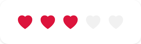 |
The first four, rendered live — edit any value:
<div style={{ display: 'grid', gap: '0.75rem', fontSize: '1.75rem' }}>
  <Rating value={4.3} />
  <Rating value={4.3} precision={1} />
  <Rating value={4.3} precision={0.5} />
  <Rating value={4.3} icon="⭐" />
</div>
Precision and rounding
Section titled “Precision and rounding”Two orthogonal props: precision is the grid a value snaps to, rounding is the direction
it snaps.
| Intent | precision | rounding | 4.3 → | 4.7 → |
|---|---|---|---|---|
| Exact / continuous (default) | 0 | 'none' | 4.3 | 4.7 |
| Round to whole | 1 | 'nearest' | 4 | 5 |
| Floor / truncate | 1 | 'down' | 4 | 4 |
| Ceil | 1 | 'up' | 5 | 5 |
| Half stars | 0.5 | 'nearest' | 4.5 | 4.5 |
| Half stars, never inflate | 0.5 | 'down' | 4 | 4.5 |
| Tenths | 0.1 | 'nearest' | 4.3 | 4.7 |
Snapping is display-only. A value of 4.28 shown as whole stars renders 4, but is never
rounded back into your state — the component never calls onChange to “correct” a value.
Icon count
Section titled “Icon count”max sets how many icons render (a positive integer, default 5). It is independent of the value —
value={3} max={10} is three of ten.
<Rating value={7.5} max={10} />
Custom icons
Section titled “Custom icons”Any ReactNode is a valid icon: an inline SVG, an emoji string, an <img>, or arbitrary JSX. Pass
emptyIcon for a distinct empty/track icon; omit it and the empty layer is the same icon dimmed via
a filter.
<Rating value={3.5} icon={<HeartFilled />} emptyIcon={<HeartOutline />} />An icon (or emptyIcon) can also be a function that receives per-icon state and returns a
node — useful for conditional rendering per position:
<Rating
  value={2.5}
  style={{ fontSize: '1.75rem' }}
  icon={(s) => <span>{s.partial ? '◐' : s.filled ? '●' : '○'}</span>}
/>
The state object is { index, fill, filled, empty, partial, active }. See
Custom icons for the full pattern and the emoji color-font caveat.
Sizing
Section titled “Sizing”Size is a single custom property, in any unit, set wherever is convenient:
<Rating value={3.7} style={{ ['--rx-rating-size' as string]: '2.5rem' }} />More visual knobs — colors, gap, the empty-layer filter — are in Styling.
Taking a rating
Section titled “Taking a rating”Providing onChange makes the component interactive. Nothing else changes about how you use it.
Try it — click, or focus it and use the arrow keys:
function Feedback() {
  const [score, setScore] = useState(0)
  return (
    <div style={{ fontSize: '2rem' }}>
      <Rating value={score} onChange={setScore} precision={0.5} label="Rate your meal" />
      <p style={{ fontSize: '1rem' }}>Selected: {score}</p>
    </div>
  )
}
Hovering previews the value; clicking commits it:

Internally this renders a radiogroup of visually-hidden native radio inputs, so arrow-key
navigation, form participation, focus-visible, and screen-reader announcements all come from the
platform rather than from hand-rolled JavaScript.
onChange receives a number — the newly selected value — not a DOM event. (That is what makes
it pair cleanly with form libraries; see Forms.)
Precision in interactive mode
Section titled “Precision in interactive mode”Interactive mode requires precision >= 0.5. Half and whole steps are selectable; continuous
input is not — a radiogroup has discrete options, so a continuous input has no discrete steps to
offer. Continuous display is fully supported at any precision.
<Rating value={score} onChange={setScore} precision={1} /> // whole-star input<Rating value={score} onChange={setScore} precision={0.5} /> // half-star inputKeyboard
Section titled “Keyboard”| Key | Action |
|---|---|
← / → (↑ / ↓) | Move the selection by one step |
| Digit keys | Jump directly to that value |
Backspace / Delete | Clear the selection |
Tab | Moves to the next control (one tab stop) |
Each rating is a single tab stop, including before anything is selected. Arrow direction follows text direction, so it stays intuitive in RTL.
Arrow keys walking up the scale, then Backspace to clear:

Hover preview
Section titled “Hover preview”onHoverChange reports the value currently previewed by pointer or keyboard, and null when the
preview ends. Use it to mirror the score in nearby UI:
const [hover, setHover] = useState<number | null>(null)
<Rating value={score} onChange={setScore} onHoverChange={setHover} precision={0.5} /><p>{hover ?? score} / 5</p>
Touch pointers are ignored for hover preview — on touch there is no hover, and a fake one would fight the tap.
Clearing
Section titled “Clearing”When interactive, re-selecting the current value clears it back to 0 (allowClear, on by default).
Set allowClear={false} to make a rating mandatory once set.
Disabled vs. read-only
Section titled “Disabled vs. read-only”disabledkeeps the element a disabled radiogroup — still announced, still discoverable, just not operable. Use it for a control that is temporarily unavailable.readOnly(or simply omittingonChange) renders therole="img"display. Use it to show a score that was never meant to be edited.
<Rating value={3} onChange={setScore} disabled /> // disabled input<Rating value={3} readOnly /> // displayFully custom rendering
Section titled “Fully custom rendering”If you want to render the whole thing yourself, useRating exposes the state machine — value, hover
preview, focus, group blur, fills, and steps — in ~900 B. See the API reference.
Warnings
Section titled “Warnings”An out-of-range prop never throws and never renders nothing. The component coerces the value into
something it can paint — clamping a value above max, flooring a negative one, falling back to a
sane max — and tells you it did so through onWarn:
<Rating value={7} max={5} onWarn={(w) => console.warn(w.message)} />// { code: 'value-above-max', prop: 'value', received: 7, used: 5, message: '…' }Every warning carries the offending prop, the value as received, the value actually used after
coercion, and a message safe to log as-is. The codes are:
| Code | Meaning |
|---|---|
value-non-finite | value was NaN or Infinity |
value-negative | value was below 0 |
value-above-max | value exceeded max |
max-non-finite | max was NaN or Infinity |
max-too-small | max was below 1 |
max-non-integer | max was fractional |
This is a development-time signal, not an error channel — it usually means a value arrived from an
API in a range you did not expect. Wiring onWarn to your logger in development is the cheapest way
to find that out; in production you can leave it off entirely.